Deep dive:
Consignment models
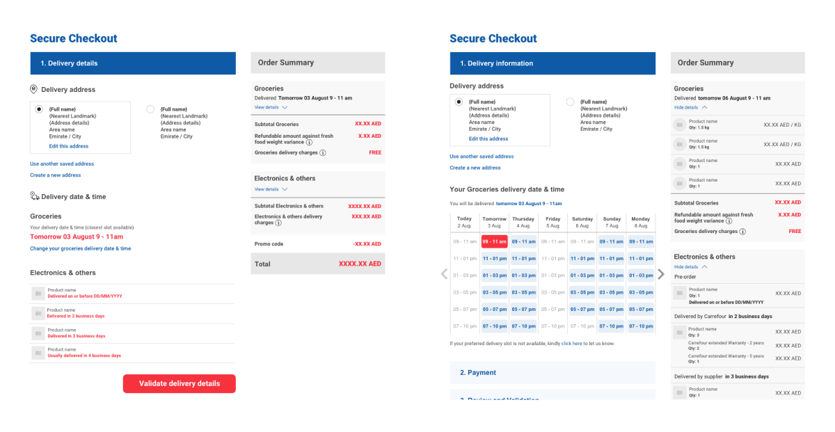
Beyond navigation, I had to design a user experience based on the different consignment models, and a custom user flow at checkout.
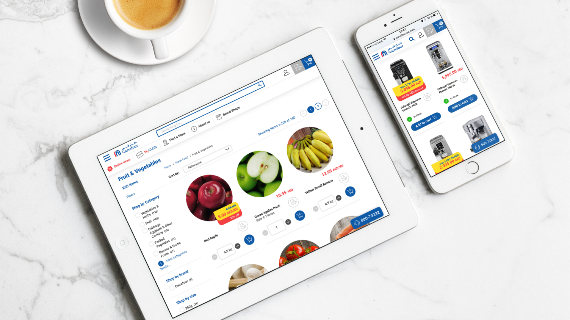
The food elements had some of their pictures in-sourced, as opposed to non-food elements which were sourced from a 1/3rd party API.
Due to the strong visual presence of the in-sourced food pictures, I decided to mask them with a circle, which extended to all products delivered within a couple of days. I kept the other products, which were on a white background, in their original square format.
The end result looked like this:

The basket provided delivery options with available delivery slots for the food basket, whilst the non-food items would have estimated delivery times and a dedicated delivery process.

The design of this delivery-specific features successfully prioritised simplicity and effectiveness. By focusing on visual hints and intuitive navigation, the website provided a seamless experience for users whilst introducing a complex business process.