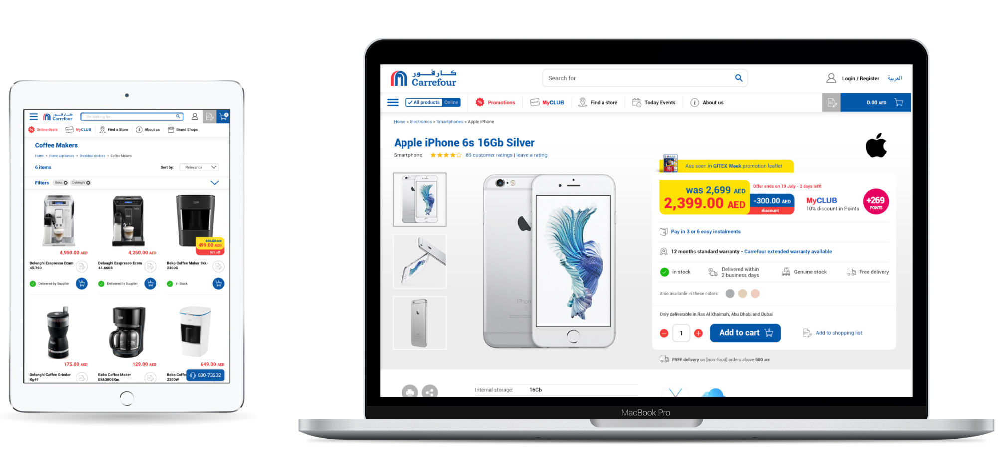
Deep dive: Prices and Promotions
One of Carrefour's distinctive features was its promotions. I conducted workshops with stakeholders, which included interviewing store staff, to lay out the foundations of the pricing and promotion components.
Designing core elements

From a Visual Design perspective, it was decided to keep the same codes as offline, and simplify them for the digital world:
- Price in red, in fairly tall font size, to carry the notion of aggressive pricing
- Yellow background for promotions to drag attention
- Decimals and currency in smaller print (decimals were kept on same size in the end due to feature prioritisation)

